
UKHSA's Inconvenient Chart
An obligatory comment about this being my first post, followed by a Covid Chart.

Hello world. This is my first post. And with it I manage to give away that I’m a 50-something, semi-reformed nerd. So be it.
I’ve been lurking around substack for a while now and thought it was about time I wrote something meaningful. Or partly meaningful. Or simply any gibberish, just to see how this content editor works.
So far, so good.
I have been watching an interesting UKHSA (formerly Public Health England) chart for the past 9 weeks.

I wondered how the delta between cases in the vaxxed and unvaxxed had changed over the 9 weeks this data has been published.
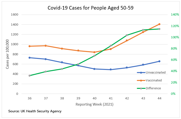
This chart shows us a couple of things, other than the fact my Excel skills are not yet fully dusted off.
Firstly general trends that could be attributed to seasonal changes are reflected in both the vaxxed (orange) and unvaxxed (blue) case rates. UKHSA’s well fisked pleadings that this data not be used to imply infectivity on the part of the vaccines can be found over at eugyppius’ substack.
The second this we can see is the delta (green) between these rates has only ever increased. This could still switch show convergence at some stage, but for now the trend is established: vaxxed cohorts are increasingly more at risk of SARS-CoV-2 infections than the unvaxxed cohorts.