


Follow the Trend
A quick look at the vaxxed vs unvaxxed case rates over 10 weeks

Financial reporting seasons appears to be clustered around quarters, leaving quite be gaps for investors to excite or fret over what may have happened in the intervening time. But for those of us fisking the pandemic panic porn we have the pleasure of weekly reporting from some jurisdictions, for example the UK Health Security Agency.
In Week 44 I compared the case rates for my age cohort over time. Time to expand that with all age cohorts, and that looks like this:
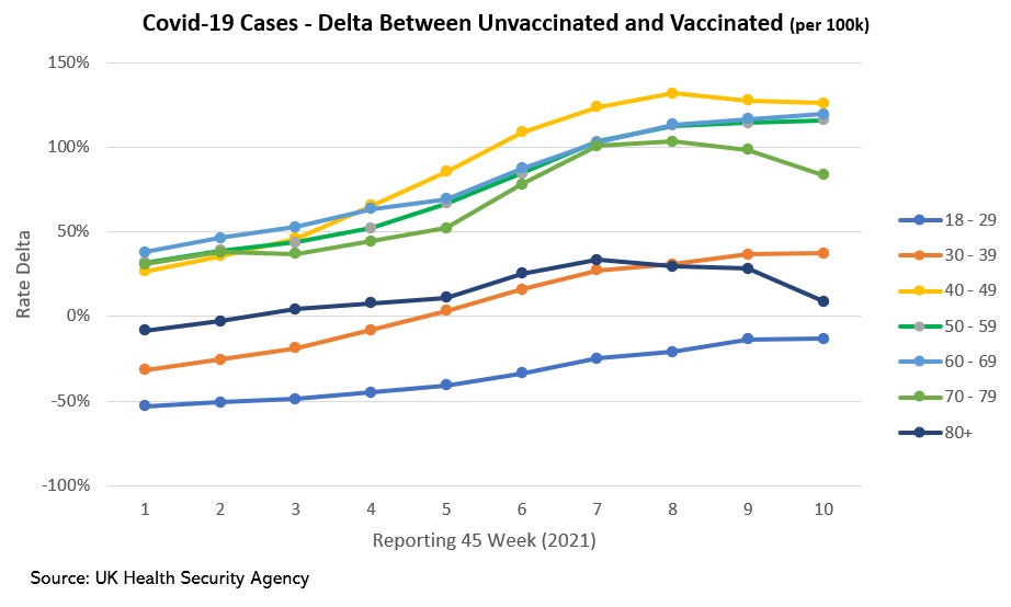
We can see the 70+ cohorts heading back towards parity, while the 40-69 plateauing at well over 100%. The other thing to note is the slow march of the 18-29 cohort towards parity.
I’ve also been watching this chart:
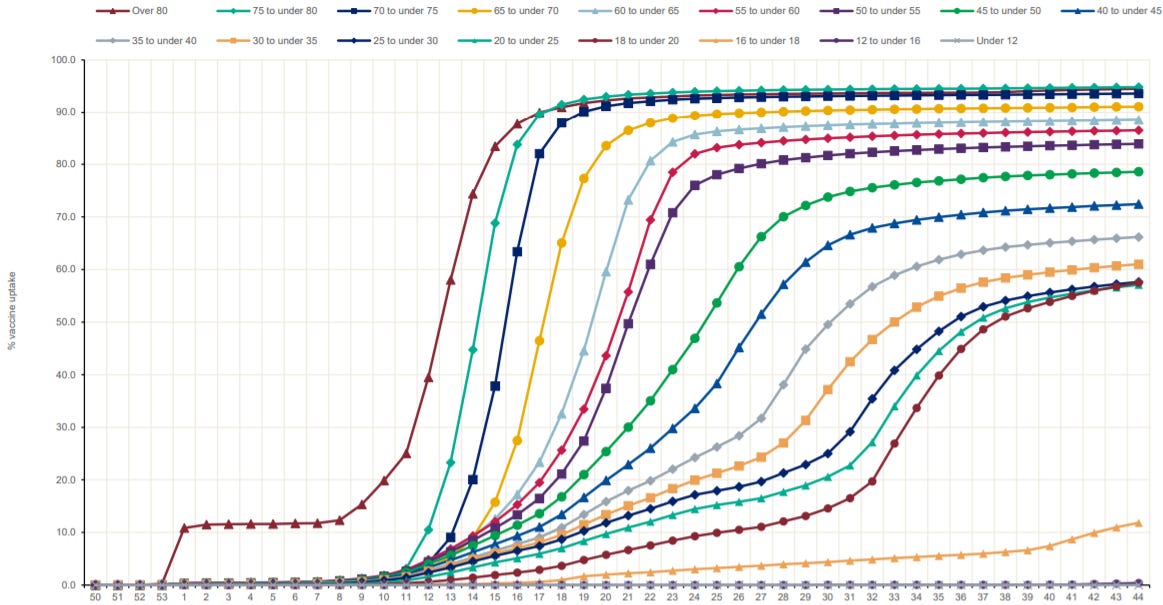
Beyond the trends, what this chart shows me is that people understand the Covid-19 risk is age skewed, and as shown on the right edge younger cohorts top out their vaccination rates at lower levels.
The positive Y axis "delta" means "per-capita vaccinated cases relative to per-capita unvaccinated cases", right?
I wrote a comment and it disappeared. Substack is broken, earlier I wrote a comment and it appeared twice.